¶ Taking good Screenshots
One important element with uploading characters (Or interactions) is presentation and First Impressions.
Basics of Screenshot taker
The screenshot handler accepts the first 5 screenshots that will be the images shown for upload.
The very top screenshot will always be the Thumbnail when uploaded.
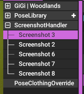
These screenshots will have to be renewed when updating a character. Which can be automatically done with the Update Screenshot button within Screenshot Handler.
¶ Make interesting poses
When making poses, you will have to put some creative grease into your character.
Adding poses that fit with the characters personality is better than straight showing off the character.
Showing off the character means to only give examples of the character.
Fitting the character means to make the character pose in a way you would expect them to.
You may want a “Showcase” of the character for one or two Screenshots that are not the Thumbnail.
But always make the screenshots more interesting than not, as those that view the images will cycle through them quickly. Make a lasting impression that the character is good with quality screenshots.
Here are some examples of good Poses turned into screenshots
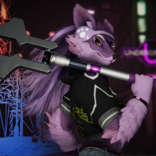
Thumbnail Example
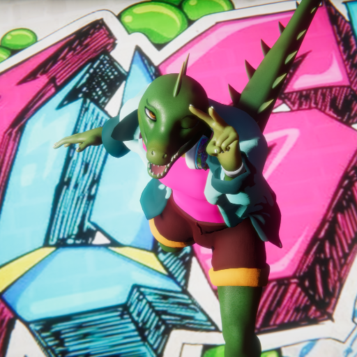
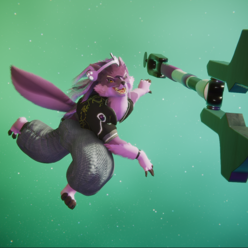
A non-thumbnail screenshot, fun dynamic pose (and angle)
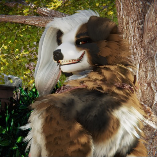
Thumbnail image with focus on the faces expression
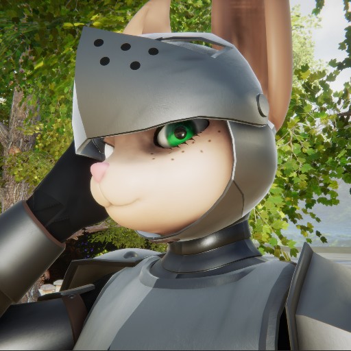
Thumbnail image, focusing on the face but with a good angle that realizes the Armor.
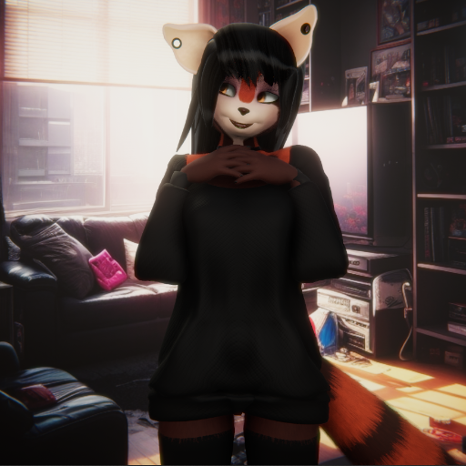
Screenshot image, using a timid but expressive pose.
¶ Often making good screenshots
Here is a quick list of things to do for an easy good screenshot of a character or situation.
- LOW FOV
Low FOV flattens the cameras point of view, making things that are far away, appear as closer. Doing so will drastically help with the next things in the list.
You will have to move and place the camera to be further away from the subject for the sake of making use of Low FOV, but the benefits are worth it.
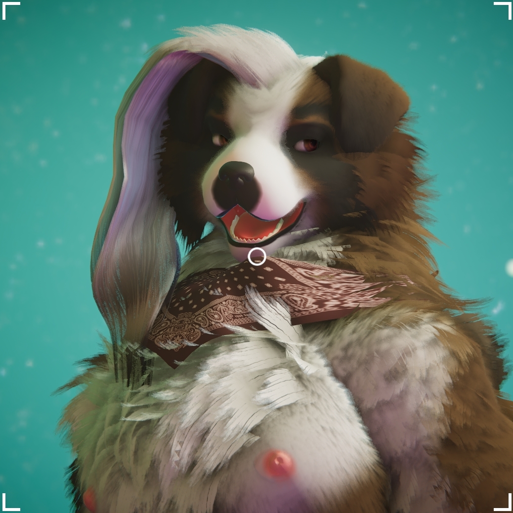
- Silhouette
Silhouette is important to have the image be comprehensible and make it feel easily recognisable. Silhouette is not only limited to the entire subject, but the shapes that the subject makes and is made out of. Having an idea of a good silhouette will help you find a good Angle as well.
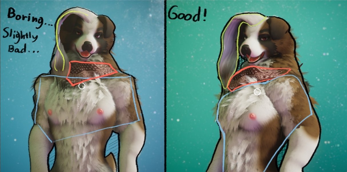
Right: The shapes that are there, are much more obvious and dont break up too hard. Has holes in diverse areas.
Dark and light colours also contribute to shapes seen onto something.
- Negative space avoidance
Avoid negative space as much as you can unless you have a plan in mind. Negative space for subject focused things dont add much especially for a 1:1 images like the ones that are allowed in FVNE. There will always be some empty space, but how much of that empty is there in a given image can make an image feel unfocused and loose.
The relationship of the empty space with the subject should be appropriate. If it is not, it will feel like it lost some opportunity for a better image.
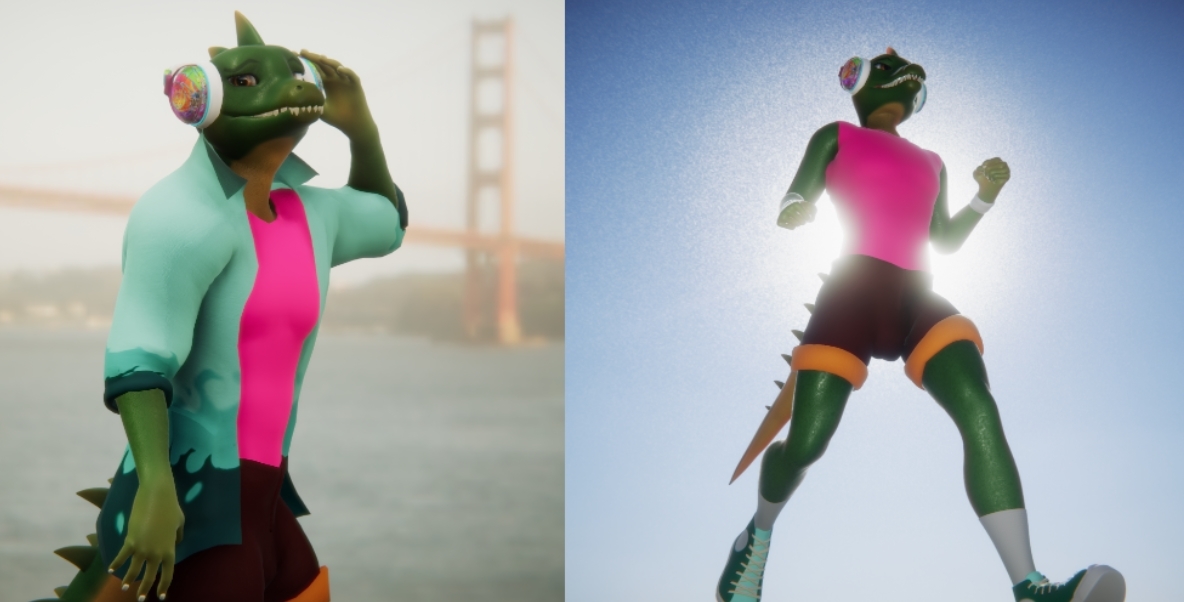
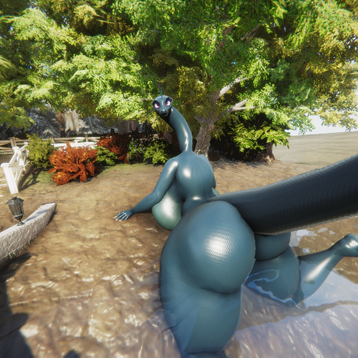
Image with seemingly High FOV, but also too much negative space, making only ¼ of the image have something.
- Restraining from showing everything!
This mostly applies to thumbnails where you feel the need to show EVERYTHING in a screenshot, especially the thumbnail. When you are proud of the character that you made where you have all kinds of content set up, you will want to show everything there is. But this is why we have 5 screenshots to spread the showcasing of the character across. This is why some restraint is warranted when making the screenshots and showing off your character.
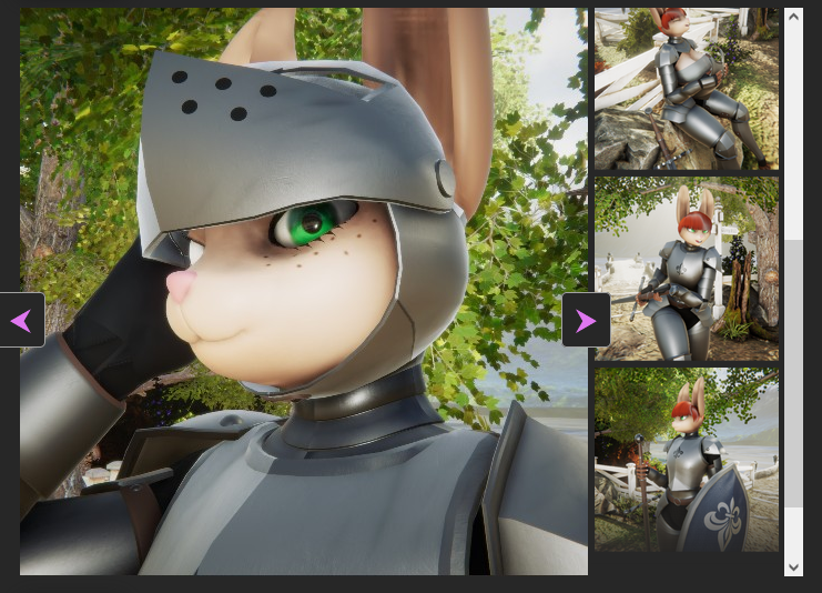
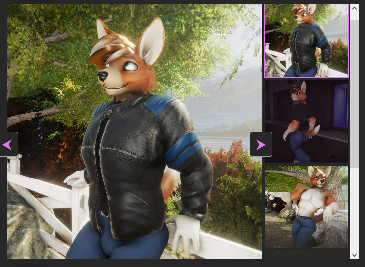
In this thumbnail, most of the character is showcased, thus making the image suffer as its first impression. Although the character is further appropriately explored in the other images.
¶ Additional elements
Other elements can be used to enhance an image as well.
- Custom backgrounds and facades
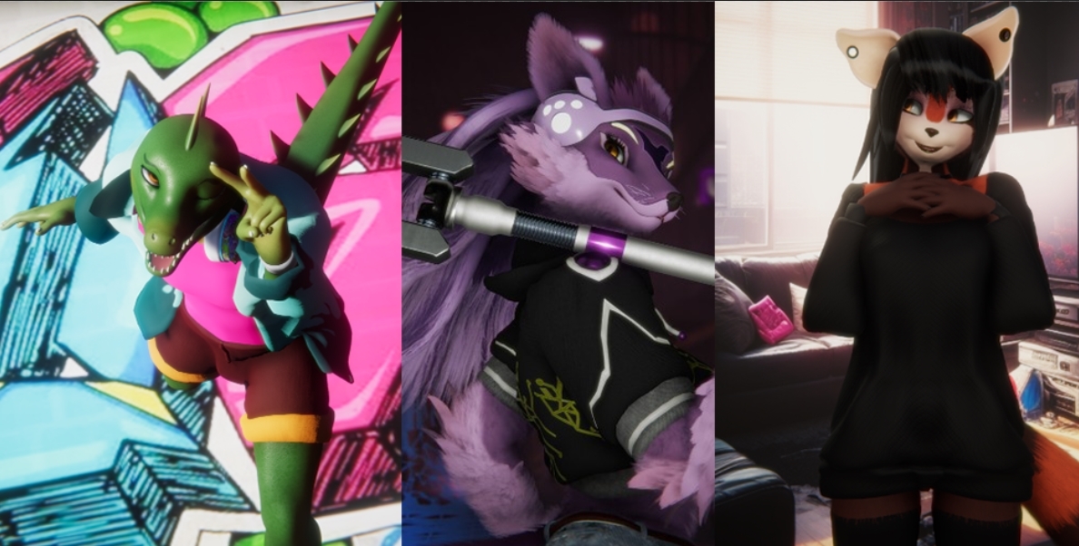
With some advance use, you can import your own facade or background to frame your images. These greatly enhances the variety of your screenshots of your character from other characters in the cloud.
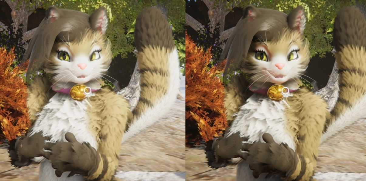
- Camera Light
Camera Light (Hotkey L) can be turned off to make the environment give the lighting to your character.
Necessary to keep on in dark shots when the character gets too obscured in dark. But otherwise, it is very much interesting to see the character in the environments lights.
¶ Conclusion
Posing, and taking screenshots does take a long time. But, with the power of updating screenshots, you only have to do it once, mostly. And it is worth giving a good impression to an audience into wanting to click into actually viewing your character.